Background
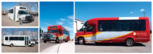
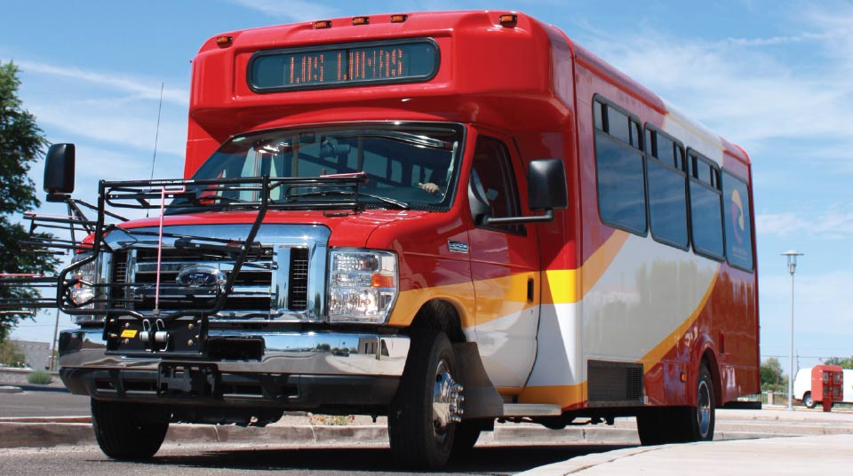
Rio Metro RTD is a bus and rail public transportation service, and is comprised of four counties that serve the most densely populated real estate in New Mexico. Its commuter flagship, The New Mexico Rail Runner Express (NMRX), spans more than 90 miles and connects New Mexico's largest city with its capital city.With the intercity commuter train gaining momentum and brand recognition, the connected rural bus systems began to grow exponentially as well. Therefore, communication with the public through consistent branding of Rio Metro, as the parent agency, became a top priority.
Key Factors
- NMRX is already an established brand and needs a parent identity.
- Rio Metro RTD is unknown to the public.
- The Rio Grande River must be used in logo creation.
- Existing log type must be used in logo creation.
- Rio Metro RTD is regional in it's mission / philosophy.
- Leverage NMRX brand equity to benefit Rio Metro
- Give Rio Metro the ability to speak on behalf of NMRX through a relatable color pallet, curvilinear elements and type treatment.
- Give the river a shape reflective of more than a river (a path, the letter "R", the appearance of going "around-the-bend").
- Maintain a "transit" undertone by using a wheel-like shape.
- Communicate Regionalism through alternating facets within the whole logo. Thus, allowing for a wide range of graphical treatments.
Strategies